-
FIFTY SHADES OF GREEN
Creative and Style Director: Yann Weber. Photography: Jenny Brough. Producer: Guillaume Folliero de Luna. Models: Awar Mou and Davey Oldenburg. Hair Stylist: Olivier Schawalder. Makeup: Cécile Paravina.
Dubbed Pantone's Colour of the Year in 2013 and again in 2017, green seems to be ubiquitous; especially since preserving nature, where it is the dominant colour, is now one of society's biggest challenges. "Long unnoticed, disliked, or rejected [...] green has become a messianic colour. It's a colour in line with the times. Now it is entrusted with the impossible mission of saving the planet," says Michael Pastoureau, a colour historian and author of the book Green: The History of a Colour (Princeton University Press) which traces a long social, cultural and symbolic history of the colour green in European societies, from Greek Antiquity to the present day. With a joyous and invigorating fluorescent shade chosen to decorate Printemps.com's website, logo and packaging, green symbolises spring; a season synonymous with renewal, marked by the regrowth of new, flourishing vegetation.
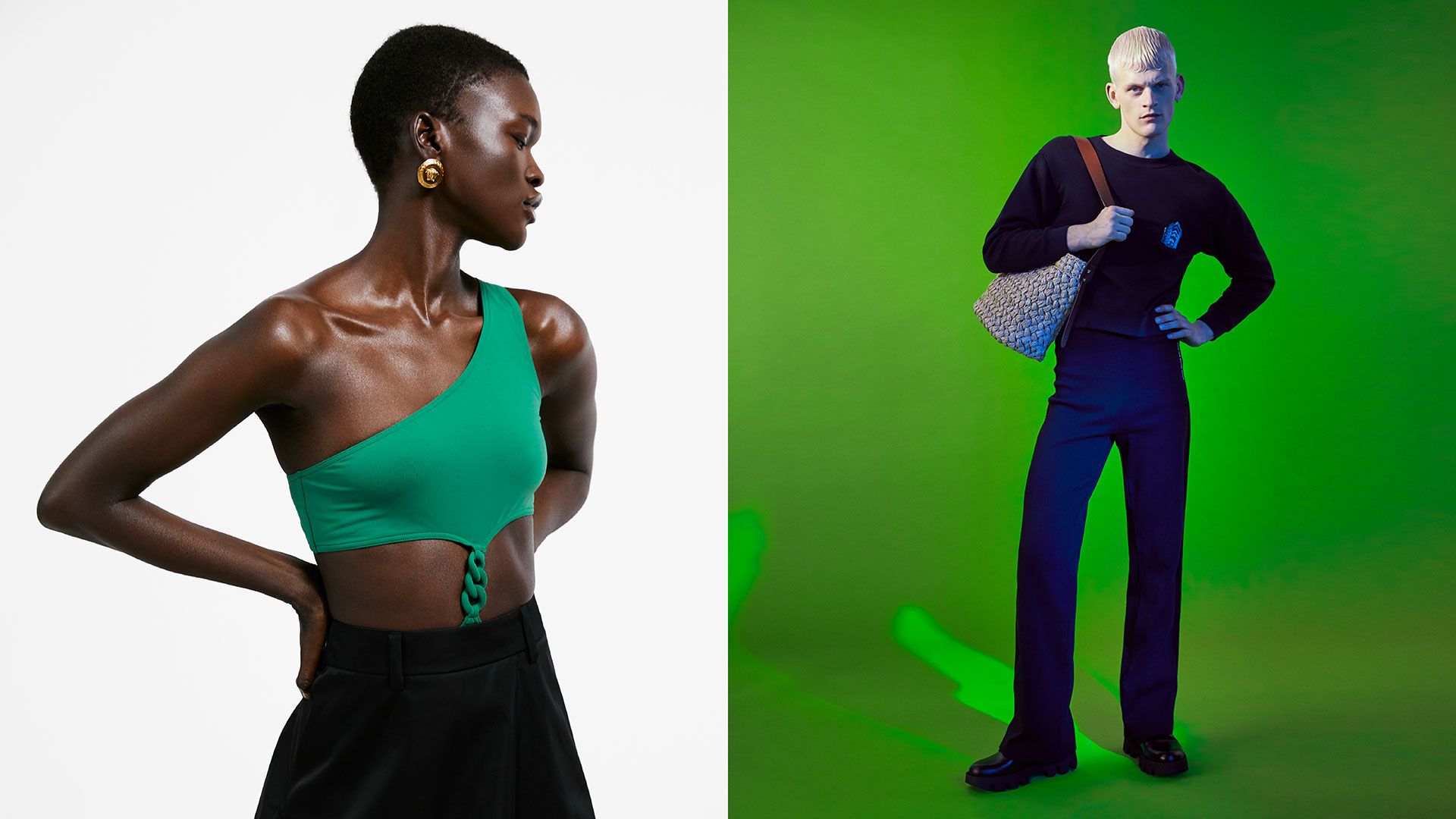
Her: Swimsuit Eres, Skirt Prada, Gold earrings Versace. Him: Sweatshirt Acne Studios, Pants Antidote, Bag Prada, Shoes Prada.
Green is therefore closely linked to the idea of freshness. "The phenomena of language reveal many things," says Pastoureau. "Of an old man one could say that he is "still green" [in French], meaning there is still some youth in him. It is also the colour of new love." Similarly, in Charles Baudelaire's poem Grieving and Wandering, he writes that the "Paradise of childhood loves" is green.
As Pastoureau points out, the significance of this colour, and its reference to renewed vitality, is contained in the very etymology of the word "green" in Romance languages, such as "vert" in French. This stems from the Latin viridis, which evokes vigour, growth, and life. "From the Middle Ages, seasons began to be associated with colours. Spring has always been green. Furthermore, [green] also expresses the light-hearted feeling that everyone has at this time of the year. Buds open, leaves multiply and grow, and flowers make their reappearance; everywhere, new, young grass sprouts, such a tender green..."
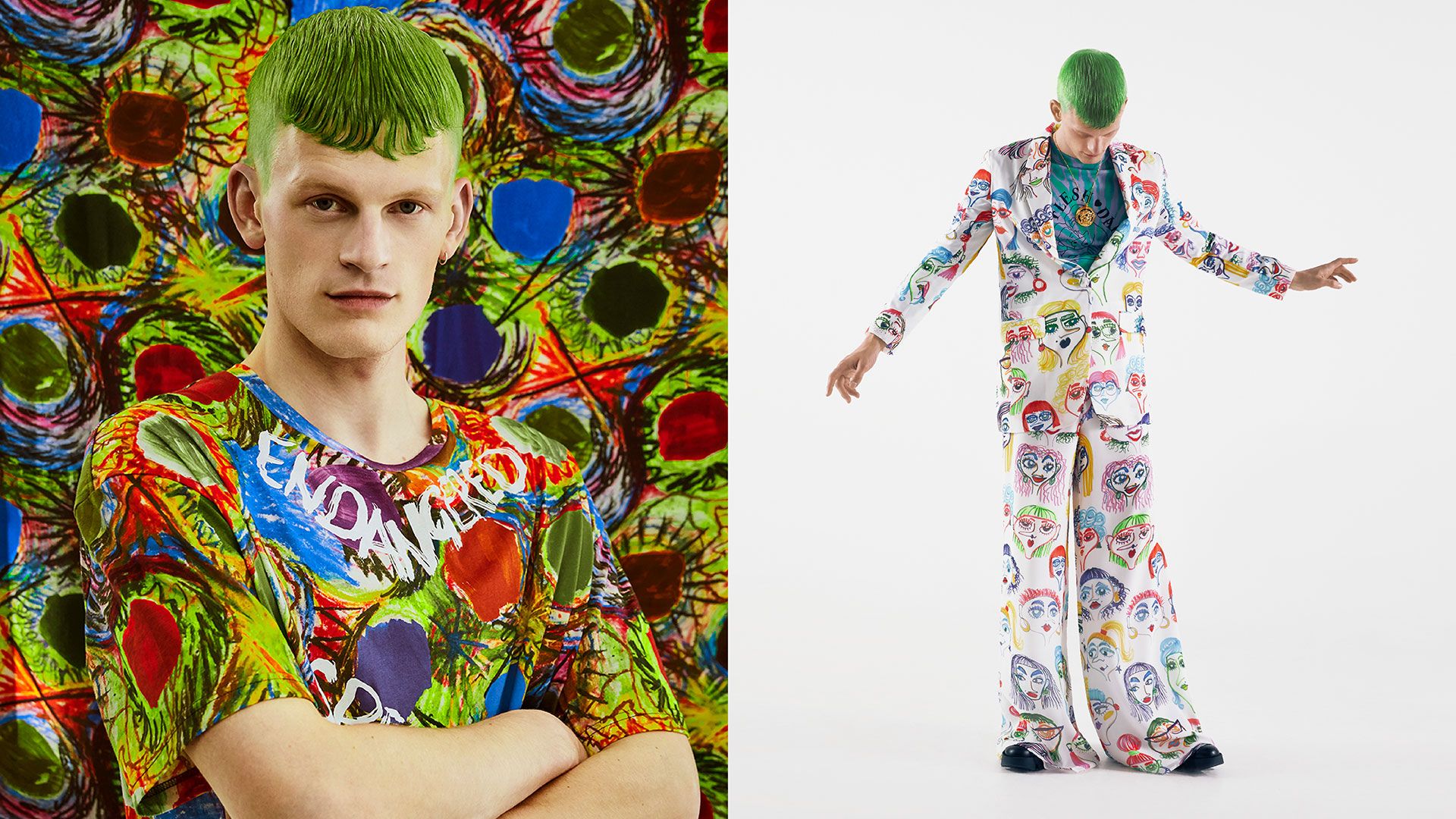
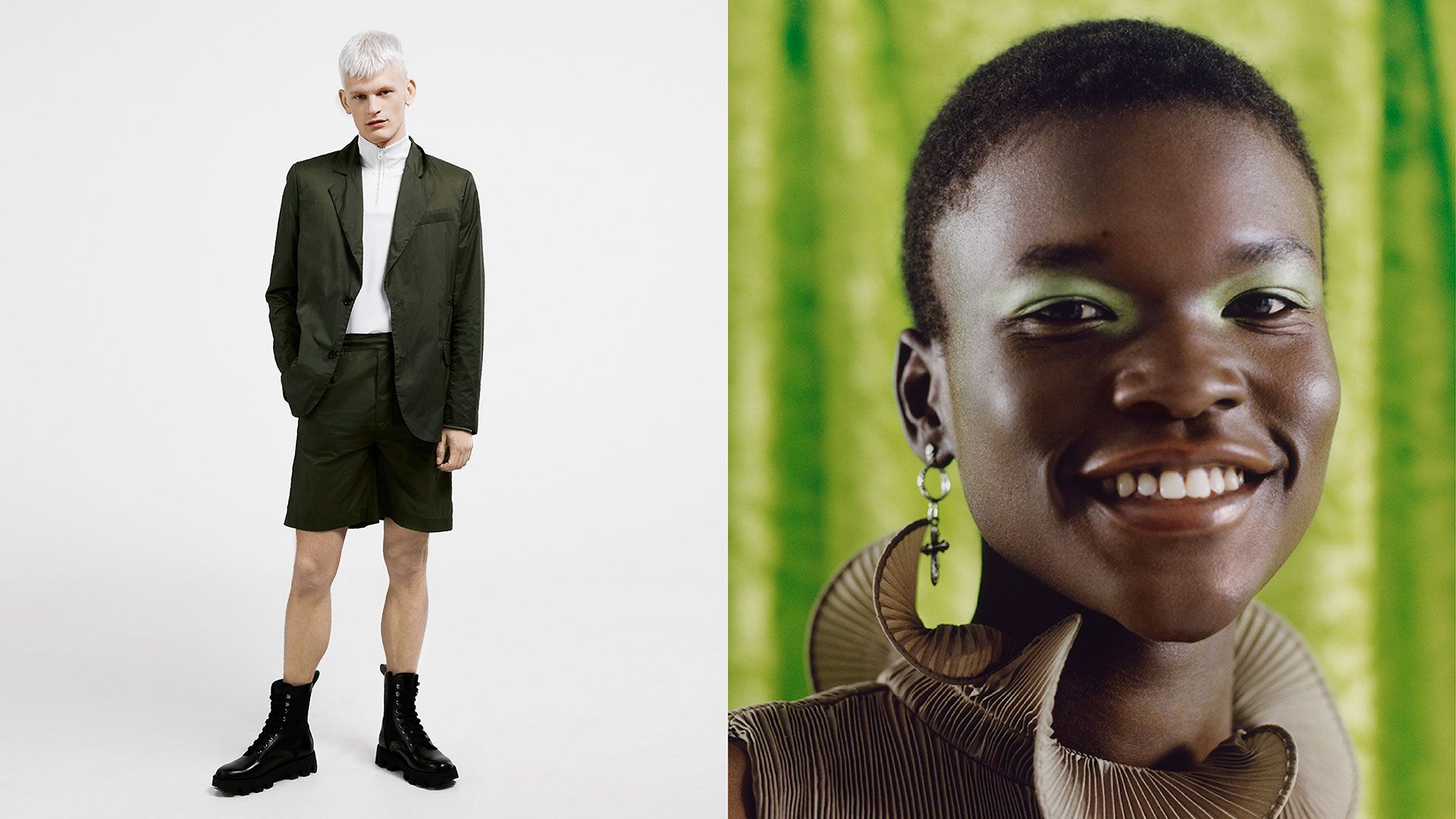
Left: T-shirt and scarf Vivienne Westwood. Right: Suit jacket Moschino, Suit trousers Moschino, Sweatshirt Carne Bollente, Necklace Versace, Shoes Prada.
Now indisputably adopted by several European environmental political parties, green's link to nature has not always been clear. "Before the start of the 19th century, the concept of nature was not green but rather the four elements: Fire, water, wind and earth. Green was only the colour of water; towards the end of the Middle Ages, the sea was coloured green on maps. The water then became blue on new geographical maps; as the lakes and forests were green, they needed to distinguish them from the sea. Associating the idea of nature with the colour green is, today, almost a reflex. And as the general school of thought only sees the beneficial effects of vegetation, we confer a lot of virtues to green." As demonstrated by the expression "going green", also indicating both a rekindling with the environment as well as a quest for peace and respite.
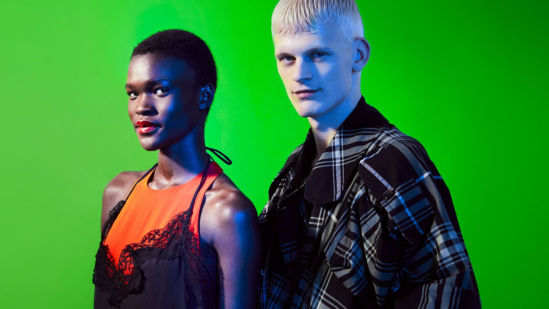
Her: Tank dress Tibi, Camisole dress Marques Almeida. Him: Overshirt Vivienne Westwood.
In fashion—an industry becoming increasingly aware of environmental issues—green and botanical prints seem to be weaving its way into more collections, as if to better reflect the challenges of our times while making use of the colour's positive connotations. For Spring-Summer 2020, Valentino and Versace livened up their creations with lush plant prints and vivid colours such as fluorescent green, which also made an appearance among the monochrome silhouettes featured in Balenciaga, Marques Almeida and Victoria Beckham's collections. With a wide range of nuance—from emerald to forest—various shades of green have also crept onto Marni, Sies Marjan and Gucci runways in recent seasons. Meanwhile, British designer Christopher Kane, unveiled a series of wildflower-print pieces during a recent show. Furthermore, brands are increasingly utilizing nature as their shows' backdrops, by staging them in wheat fields, or creating a forest with real trees that are then replanted. Nature and green are being celebrated now more than ever.
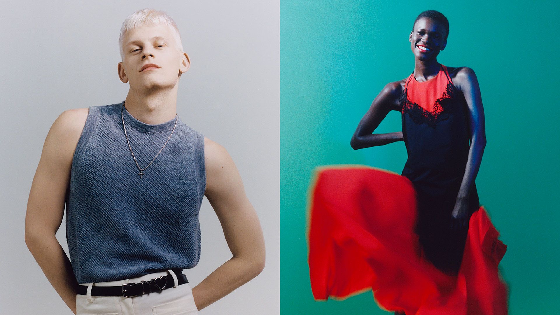
Him: T-shirt Carcel, Tibi pants, Y/Project belt, Necklace Emanuele Bicocchi. Her: Tank dress Tibi.
Jean-Gabriel Causse, colour specialist and author of the book Les crayons de couleur (The Coloured Pencil Factory), talks enthusiastically about the positive effects of the colour green. "More and more of us on Earth live in towns are lacking green. That's why we build "green spaces", why we buy green plants for our homes." In his 2014 essay The Astonishing Power of Colours, that describes several scientific experiments analysing how colours influence our behaviour and mood, Jean-Gabriel Causse retells a good number of anecdotes on the surprising properties of green, which in his view, is the ultimate "happy medium" colour. "It's a balanced and balancing colour", he claims. Between cold and relaxing blue, and warm and energising red, green subdues; it offers a level-headedness. "It has the unique characteristic of being directly in the centre of the colour spectrum, between infrared and ultraviolet. Around 550 nanometres, to be exact". Causse explains. Green, the colour of concentration, is conducive to reading (as evidenced by the green library lamps seen in Harvard and the French National Library), the colour of medicine and health. It also has the power to soothe migraines, according to scientists who exposed headache patients to different coloured lights. Jean-Gabriel Causse adds: "While conducting MRI brain scans, scientists analysed parts of the brain that lit up when the participant is shown green blocks, indicating that both the right and left hemispheres of the brain are activated in a very schematic way. That's why it's the ideal colour for reading; when you need to concentrate but also access your imagination."
Him: Acne Studios jacket, Pants and Bermuda shorts Acne Studios, Sweatshirt Acne Studios, Boots Prada. Her: Dress Tibi, Earrings Emanuele Bicocchi.
As the colour of the US dollar and the lucky four-leaf clover, green also has the ability to inspire confidence. "In Las Vegas, casinos carried out tests to find out the best colour for a roulette mat," Causse says. "They found that when the mats were blue, people played half-heartedly, whereas when they were red, they bet more money but stopped quickly. On a green mat, however, people played moderately and continued to play even when they were losing!" But as with every colour, green can bring mixed emotions. Exhausting for many painters & dyers for many years, its chemical instability contributed to the difficulty of its production and perseverance over time. Moreover, it has gradually permeated its symbolism to make it the metaphor and embodiment of all that is unstable, fickle, ephemeral or double-edged, like chance, fate, fortune, and hope. Isn't the light seen across the bay in The Great Gatsby green, as is the colour mentioned by Dante at the end of Purgatory in Divine Comedy?
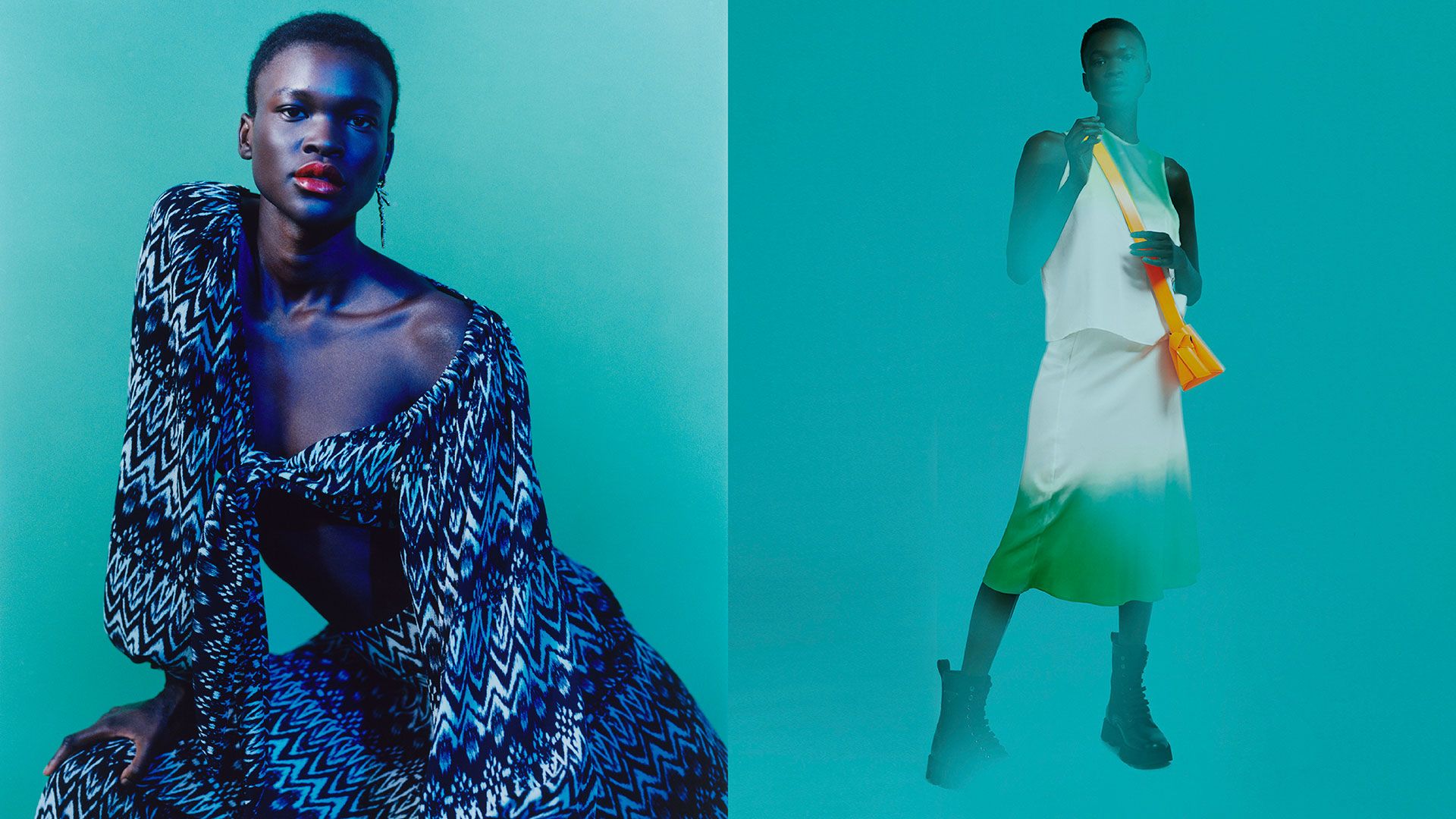
Left: Shirt Tongoro, Tongoro pants, Earrings Versace. Right: Skirt Carcel, Shirt Carcel, Bag Acne Studios, Shoes Prada.
Nowadays at least, green has been able to make a comeback. And contrary to red, which is both its complementary and contrasting shade, green is positive; it validates, authorises and urges us to move forward. "Green became the colour of freedom towards the end of the 18th century. In scientific theories, it began to be thought of as the opposite of red, and as red symbolised danger and prohibition, it became the opposite: The colour of freedom, and permission," Pastoureau explains. "The best example of this is the traffic light," Causse continues. Prompting to overlook its association with misfortune that remains prevalent in the world of theatre, or any of its insincere uses linked to "green washing", green is now the colour of progress and the future. According to Michel Pastoureau, "we have embraced the idea that the planet is in danger; that it needs more nature and vegetation, and therefore more green." Another reason to bet on this colour, as the wheel of fortune continues to turn for our future.
